In a recent paper, initially more out of necessity than as a design choice, I hand-drew the data visualisations. Turns out the reviewers were huge fans, so I kept them. Here are the resulting images for your perusal. And maybe for future inspiration.
Feelings 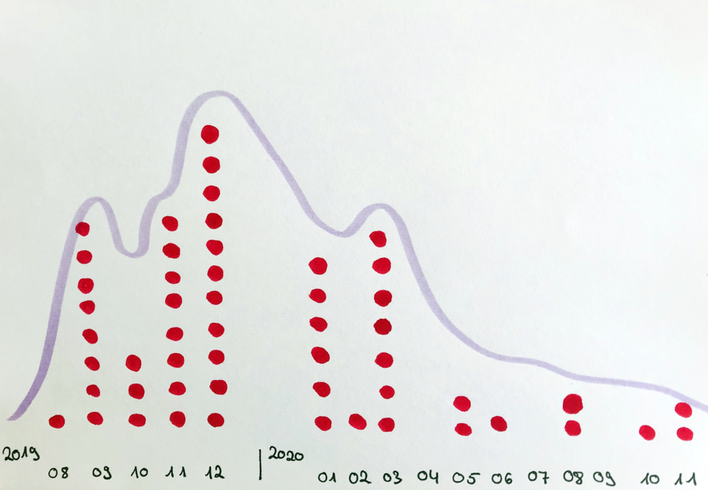
Instances across time 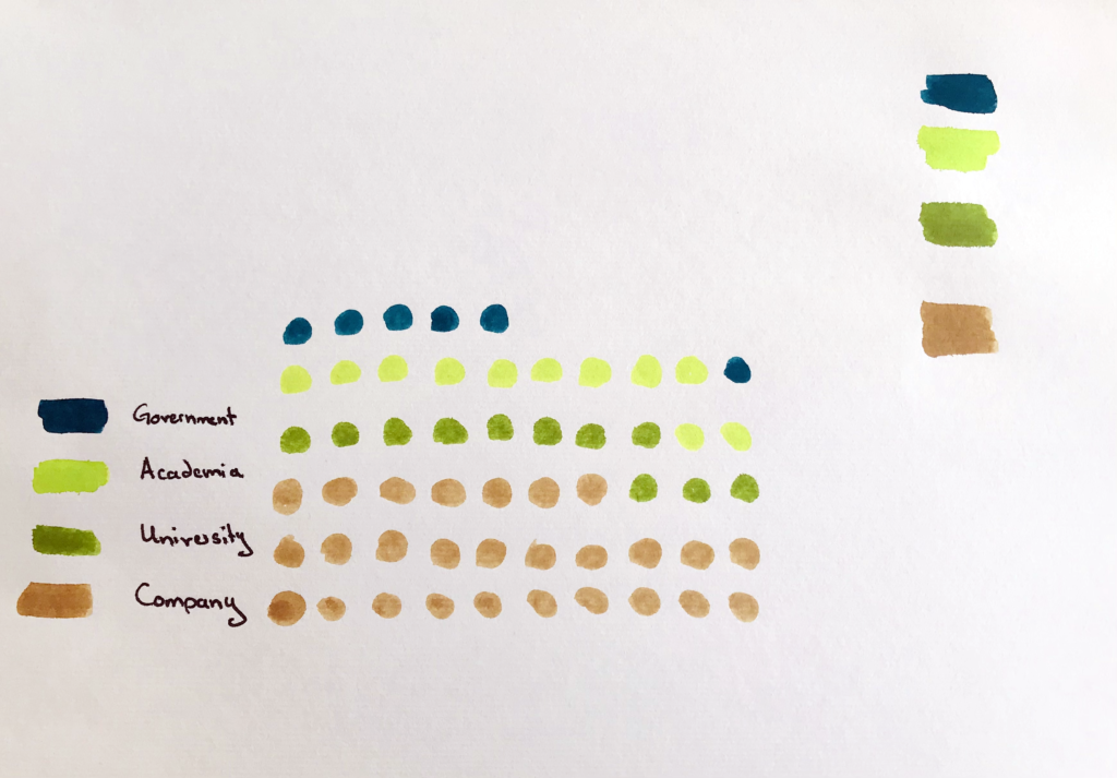
Instances across type
Alt text (as I don’t know how to add it to a gallery):
Three figures in a row.
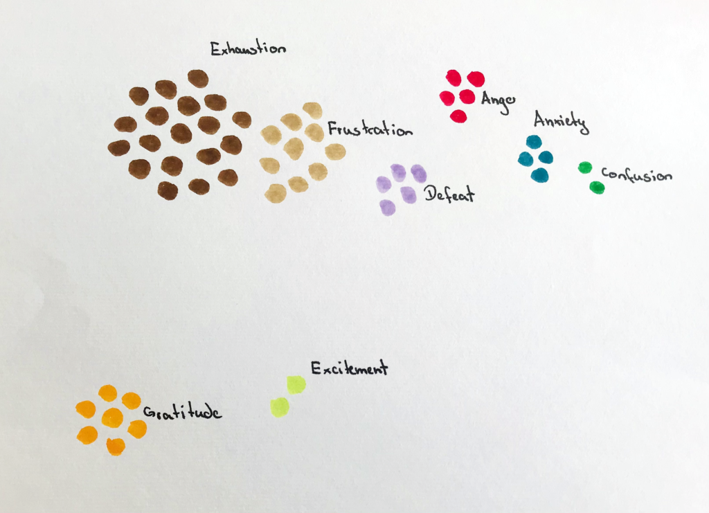
Figure 1: Groups of dots drawn to represent my feelings. 19 dots in dark brown stand for exhaustion, ten dots in light brown for frustration, five dots in red for anger, five dots in light purple for defeat, four dots in dark blue for anxiety, two dots in dark green for confusion on the upper line. In the lower line, there are seven yellow dots for gratitude and two light green dots for excitement.
Figure 2: Drawn timeline of initial engagements for each case ranging from August 2019 to November 2020 with a trend line on top. For 2019, there is one engagement in August, eight in September, three in October, eight in November, and eleven in December. For 2020, there are six in January, one in February, seven in March, two in May, one in June, two in August, one in October, and two in November.
Figure 3: A set of 55 dots drawn to represent the different types of cases. 27 are in light brown to indicate Company types, eleven are in dark green to represent University types, another eleven are in light green for Academia types and six in dark blue for Government types.